Shelf Wars: The Packaging Design Science Behind India’s Fastest Growing Namkeen and Snack Brands
April 14, 2026Shelf Wars: The Packaging Design Science Behind India’s Fastest Growing Namkeen and Snack Brands
The Indian namkeen and snack market is one of the most brutally competitive FMCG categories in the country. The category is enormous, fragmented, regionally diverse, and driven almost entirely by impulse at the point of purchase.
No consumer walks into a convenience store having decided in advance which bhujia they will buy. They walk in for a reason unrelated to snacks. They pass the snack rack. Something catches their eye. In under two seconds they have reached for a pack. The decision is made before conscious deliberation begins.
That two second window is where namkeen and snack brands are won and lost. And it is determined almost entirely by packaging design.
Why Gujarat’s Namkeen Industry Faces Its Biggest Brand Moment
Gujarat and specifically Ahmedabad, Rajkot, Bhavnagar, and Surat is home to some of India’s finest namkeen production. The recipes developed over generations, the specific spice profiles, the texture quality these are genuine competitive advantages that no factory in any other state can fully replicate.
But the category is changing at pace. The entry of nationally distributed organised brands, the growth of D2C snack companies with premium brand identities and direct consumer relationships, and the increasing penetration of modern trade where visual brand identity determines shelf placement have created a competitive environment where craft and recipe alone are no longer sufficient to sustain growth.
Gujarat’s namkeen brands must now compete on brand identity with the same seriousness with which they have always competed on product quality. The recipe is the foundation. The brand is the structure built on it.
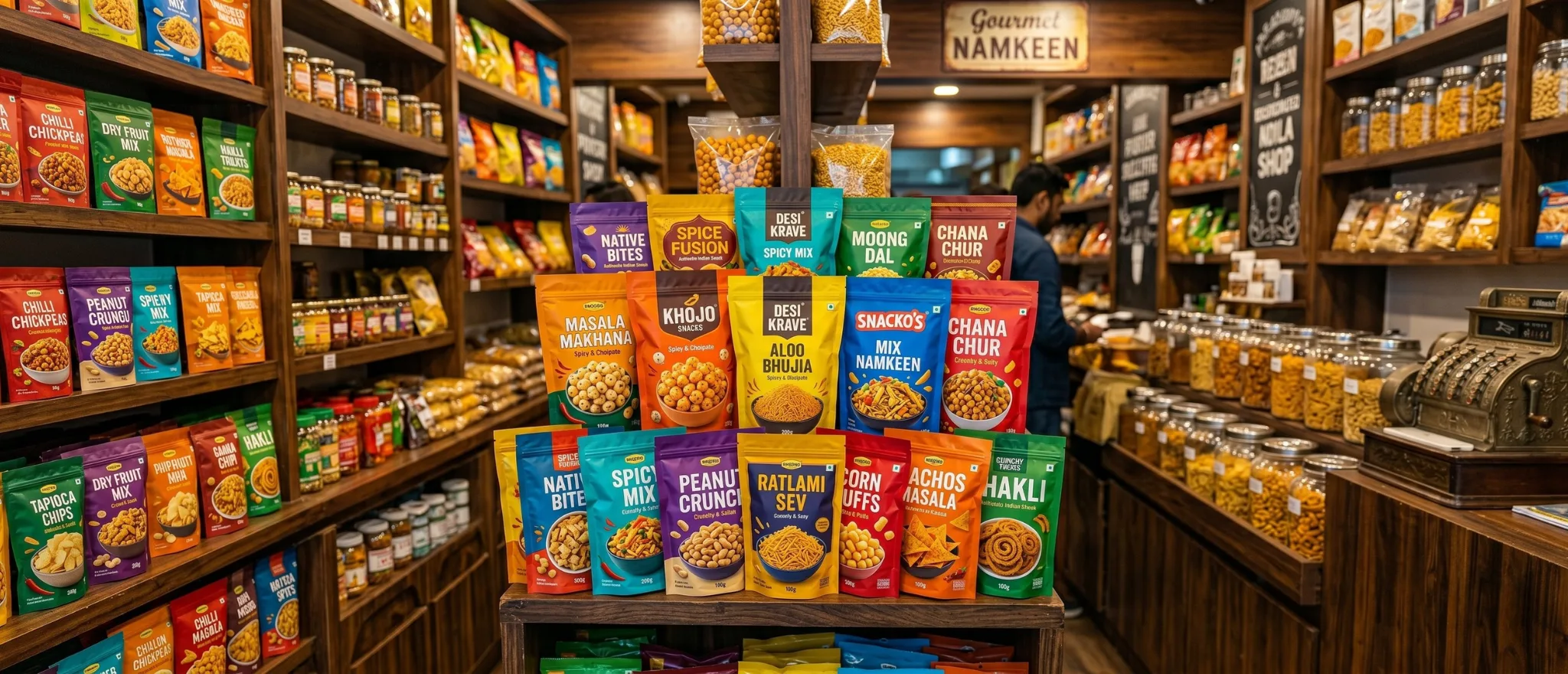
The Packaging Design Principles That Win the Snack Aisle
Bold at 2 Metres
The first test of snack packaging design is visibility at distance. In a general trade kirana store, your product may be displayed on a shelf or in a bin 2 to 3 metres from the consumer. The brand name and the product character must be readable and compelling at that distance.
This requires high contrast between background and foreground. A dominant brand mark that is bold enough to read as a shape before it is read as text. And an overall colour scheme that creates a stop signal something the eye catches even in peripheral vision.
Flavour Communication That Triggers Appetite
The most powerful element in any namkeen or snack pack is the flavour visualisation the photograph or illustration that communicates not what the product is made from, but how it will taste.
A photograph of actual bhujia or mixture is less powerful than an image that communicates the experience: the crunch, the spice, the richness, the flavour hit. The product visual should trigger a physical response the consumer should almost taste the product before they have picked up the pack.
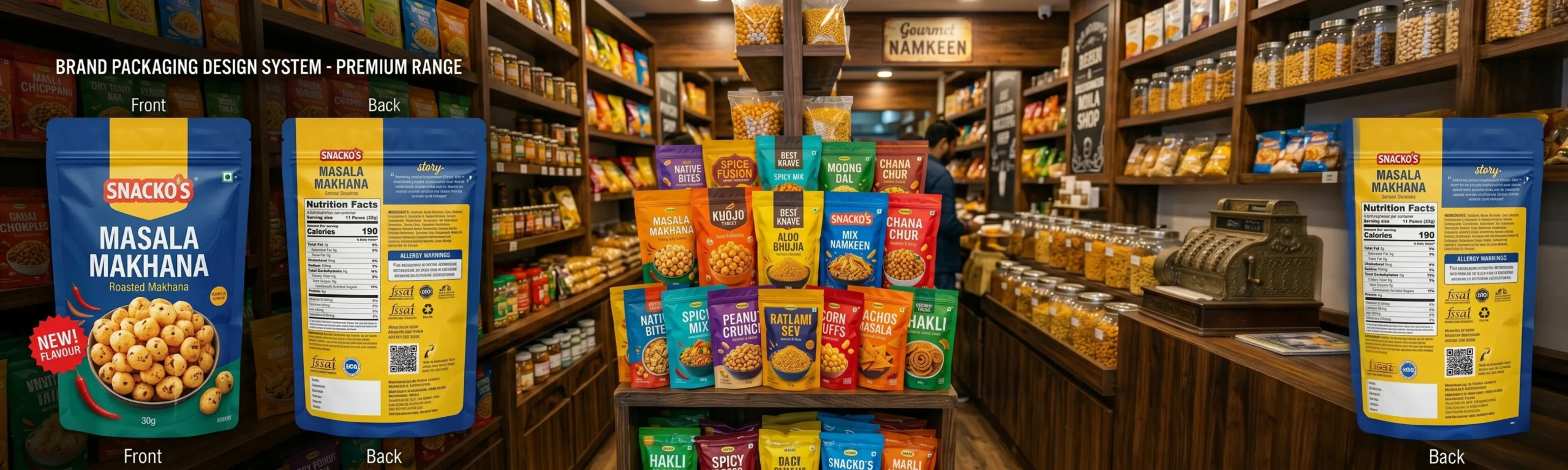
Range Architecture: Building a Snack Family
One of the most common and most expensive mistakes in namkeen brand building is launching multiple flavour variants without a coherent range architecture. The result is multiple packs that look like they come from different companies no visual family relationship, no range recognition.
A well designed snack range architecture creates a consistent brand block on the shelf: the same brand visual system across all variants, differentiated by colour coding for flavour. The consumer recognises the brand across the range and navigates to their preferred flavour. The brand block is visible even when individual SKUs are not fully stocked.
The Flavour Callout Hierarchy
In a category where flavour is the primary purchase driver, the variant callout Aloo Bhujia, Punjabi Mixture, Khatta Meetha, Chilli Lime, Classic Sev must have clear visual hierarchy on the pack. It should be readable at the distance from which the consumer is likely to be browsing.
The secondary callouts net weight, quantity, price point must be present and compliant without competing with the primary flavour communication. Regulatory information that crowds the flavour story costs the brand appetite appeal.
Premium Namkeen: The Fastest Growing Segment
The Indian premium snack market is growing significantly faster than the mass market. Consumers in Mumbai, Bengaluru, Pune, and among the Indian diaspora in Dubai are actively seeking premium namkeen options products at 2 to 3 times the mass market price point, delivered in packaging that communicates quality commensurate with the price.
- Premium packaging materials: structured pouches with matte finish, resealable zips, premium print quality
- Brand storytelling on pack: the founding generation, the recipe origin, the regional craft tradition
- Photography quality: professional appetite photography rather than generic product images
- Portion formats: premium consumers respond to smaller premium priced single serve formats alongside standard sizes
- Gift packaging: during Diwali, wedding, and festive seasons, premium namkeen gift sets are among the highest margin products in the category
The namkeen shelf is one of the most visually competitive environments in Indian retail. Winning it requires packaging that works in two seconds and then builds a brand relationship that brings the consumer back for the next pack.
Ready to build a brand that commands your market?
Visit richestbranding.com | info@richestbranding.com