
What Makes a Logo Worth Crores: The Strategic Science Behind Brand Marks That Build Market Leading Companies
April 15, 2026What Makes a Logo Worth Crores: The Strategic Science Behind Brand Marks That Build Market Leading Companies
There is a question every business owner asks when presented with a logo design invoice: why does this cost what it costs? It is a fair question. To the eye, a logo is a simple thing a mark, a name, perhaps a symbol. What could possibly justify the investment?
The answer is not in the logo itself. It is in what the logo does over the life of the company that commissions it.
A logo is the most reproduced piece of communication a business will ever create. It appears on every product the company ships, every communication the company sends, every vehicle the company operates, every uniform an employee wears, every exhibition stand, every business card, every invoice, every digital platform. Over the life of a business, a single logo is seen millions of times by thousands of people.
The question is not what the logo costs to design. The question is what each of those millions of impressions is communicating and whether what they communicate is building the company’s brand equity or quietly undermining it.
The Five Qualities of a Logo That Builds Brand Equity
1. Distinctiveness
A logo that looks like every other logo in its category communicates nothing specific. It is not a brand mark it is a placeholder. The consumer cannot distinguish it, cannot recall it, and cannot feel anything about a company through it.
Distinctiveness does not mean bizarre or attention seeking. It means owning a visual space that no competitor occupies. The most distinctive logos are often the simplest because simplicity, executed with genuine originality, is the hardest design achievement in brand identity.
2. Scalability
A logo must work at every scale at which it will be used from a 16 pixel browser favicon to a 6 metre trade show stand banner. A logo that is beautiful at presentation size but loses its integrity when reproduced small or becomes invisible when enlarged is not a professional brand mark.
Scalability requires that the logo is designed as a system: a primary full version, a compact version for small applications, a monogram or symbol version for the smallest contexts, and rules for how each version is used.
3. Legibility Across Media
A professional logo must work in full colour, in single colour, in black, in white reversed out of a dark background, embossed without any colour, and engraved in single material. A logo that depends on colour to communicate its essential character has a fundamental design weakness because there are contexts where colour cannot be reproduced.
The embossed lid of a spice tin. The woven patch on a garment. The carved signage above a retail entrance. The stamp on a certificate of authenticity. Each of these applications strips colour from the logo. The mark that survives without colour is the mark with genuine design integrity.
4. Timelessness
The logos that build the most brand equity over time are the logos that do not look dated within a decade. They may be refined evolved, modernised in detail but their essential character is permanent.
The most expensive logo a company can commission is one that needs replacing in five years because it was designed around a trend rather than a brand truth. Every time a logo changes significantly, the accumulated visual recognition equity is partially reset.
5. Meaning That Earns Discovery
The best logos reward attention. They communicate something specific about the brand’s values, heritage, or promise but they do so with restraint. The meaning is there for those who look, but the logo does not shout it.
A family business logo that incorporates a subtle reference to the founding year. A food brand’s mark that contains a hidden reference to the key ingredient. A Gujarat based textile brand whose logo honours a pattern from the regional craft tradition. These are the kind of brand stories that create the conversations that build brand community.
The Logo Design Process: What It Actually Involves
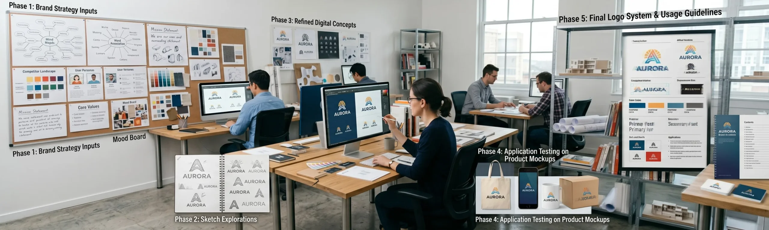
Strategy Before Aesthetics
A professional logo design process begins not with sketches but with questions. Who is this brand for? What does it stand for? What category does it operate in, and what are the visual conventions of that category both to respect and to break? What is the single most important thing this logo must communicate?
The answers to these questions are the brief from which the visual exploration begins. Without them, the designer is making aesthetic choices in a vacuum. With them, every design decision is purposeful and defensible.
The Exploration Phase
A professional logo design process explores a wide range of directions before narrowing. Not two or three options but dozens of sketch level explorations that test different visual strategies for communicating the brand’s essential character. The exploration phase is where originality is found and where the strongest directions are identified for refinement.
Refinement and Application Testing
Once the strongest direction is identified, the professional refinement process is rigorous: testing the mark at every scale, in every colour application, on every relevant medium. A logo that has not been tested embossed on packaging, reversed white on the brand’s primary colour, at 16 pixels on a digital screen, and at 6 metres on a printed banner has not been professionally refined.
What Your Logo Is Costing You If It Is Weak
- Every premium price point you cannot defend because the logo does not communicate premium
- Every qualified lead who visits the website and leaves because the brand does not pass the credibility test
- Every export inquiry that does not convert because the packaging logo does not meet international retail standards
- Every talented candidate who chooses the competitor whose brand feels more aspirational
- Every partnership conversation that starts with an apology for the brand rather than pride in it
A logo is not a cost. It is the visual foundation on which every rupee of brand equity is built. The investment in a great logo is not recovered in the first year it is recovered in every interaction, over every year, for the life of the company.
Design it once. Design it right. Build on it for decades.
Ready to build a brand that commands your market?
Visit richestbranding.com | info@richestbranding.com