From Formula to First Impression: How Premium Skincare Packaging Design Builds Brands That Command Global Shelves
April 21, 2026From Formula to First Impression: How Premium Skincare Packaging Design Builds Brands That Command Global Shelves
In the skincare and beauty category, the packaging is evaluated before the formula ever touches skin. The consumer picks up the bottle, feels its weight, reads the label, and makes a judgement about what is inside based entirely on what she holds in her hand. This judgement happens in under ten seconds and it determines whether the product is purchased, tried, loved, and repurchased or put back on the shelf.
India’s skincare industry is at a remarkable moment. The country produces world class formulations from Ayurvedic ingredient combinations that carry millennia of refinement to cutting edge cosmeceutical actives manufactured to international pharmaceutical standards. Bengaluru, Mumbai, and Pune have produced some genuinely exceptional skincare brands in the last decade.
And yet, too many of these brands are still dressed in packaging that does not match the quality of what is inside. The formula is premium. The packaging communicates mid market. The consumer takes the cue from the packaging not from the formulator.
The Skincare Consumer Decision Journey and Where Packaging Intervenes
Understanding where packaging intervenes in the skincare purchase decision is essential to understanding why it deserves the investment it requires.
The decision journey for a premium skincare purchase whether it happens in a Sephora in Dubai, a Nykaa flagship in Bengaluru, or on an e commerce platform from a mobile screen follows a consistent pattern. Discovery through a recommendation, an advertisement, or a social media post. Evaluation of the brand’s visual identity and claims. Physical or digital examination of the packaging. Purchase decision made.
Packaging intervenes at the evaluation and examination stages simultaneously. It is the bridge between the brand promise communicated in discovery and the product experience that will determine repurchase. If the packaging does not fulfil the promise, the purchase funnel collapses at the most expensive point right before conversion.
The Design Elements That Define Premium Skincare Packaging
Material Selection as Brand Language
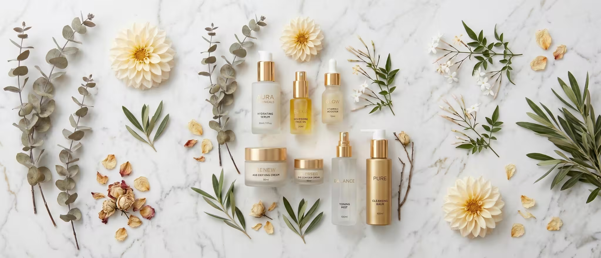
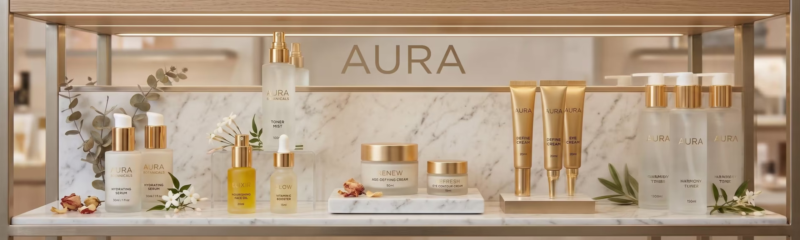
In premium skincare, the container is the first quality signal. Glass communicates premium, stability, and efficacy particularly for active ingredient formulations like vitamin C serums, retinol treatments, and AHA exfoliants where the consumer understands that the ingredient is sensitive to air and light. A brand that chooses violet glass, amber glass, or frosted glass communicates formulation seriousness before any ingredient claim is read.
For skincare brands targeting the premium segment in Dubai, Singapore, or the UK, glass is often not optional it is an expectation. International beauty retail buyers in Sephora, Space NK, and Tangs evaluate packaging material as an immediate proxy for brand positioning. A premium skincare claim in a basic PET plastic bottle creates a credibility gap that no marketing investment can fully bridge.
Colour and Finish: The Emotional Register of Skincare
Skincare packaging colour palettes communicate brand personality and product philosophy before a single word is read. White and off white palettes communicate clinical cleanliness and efficacy. Earthy tones terracotta, sage, warm beige communicate natural and botanical positioning. Black and deep charcoal communicate luxury and prestige. Soft pastels communicate gentle, sensitive skin positioning.
The finish of the packaging amplifies the colour signal. Matte finish communicates premium restraint. High gloss communicates accessibility and vibrancy. Soft touch coating a tactile finish that feels like velvet communicates ultra premium and creates a physical brand experience the moment the consumer picks up the product.
Typography That Earns Trust
Skincare packaging typography must navigate a specific tension: the need to communicate brand personality through display typography, and the need to communicate clinical credibility through ingredient and claims typography. These are different registers and they require different typographic voices.
The brand name and product name benefit from a refined, distinctive typeface that communicates the brand’s aesthetic position. The ingredient names, percentage actives, and usage instructions require clean, legible typography that communicates precision and scientific credibility. The best skincare packaging systems manage both registers within a coherent visual hierarchy.
The Label as Real Estate
On a 30ml serum bottle, the label is approximately 4 centimetres by 8 centimetres. In this space, the brand must communicate: the brand identity, the product name, the hero active ingredient and its concentration, the skin concern addressed, any certifications relevant to the target market, and usage instructions. The organisation of this information what is primary, what is secondary, what is tertiary is a discipline as rigorous as any copywriting brief.
The brands that win premium skincare shelf placement internationally make every millimetre of label real estate work. Nothing is placed by default. Every element has a reason for its position, its size, and its relationship to the elements around it.
The D2C Skincare Packaging Opportunity in India
India’s D2C skincare segment is growing at a pace that the organised beauty retail market is only beginning to reflect. Brands built entirely on direct consumer relationships sold through brand websites, Instagram storefronts, and platforms like Nykaa and Purplle have a packaging advantage that traditional retail brands do not: the unboxing experience.
- The outer shipping box is a brand touchpoint: branded tissue, custom inserts, and a handwritten or printed welcome note convert the delivery moment into a brand experience
- The product packaging must photograph beautifully for user generated content Instagram posts, YouTube reviews, and reels are the highest credibility marketing a skincare brand receives
- Sustainable packaging choices glass, recycled materials, refillable formats resonate strongly with India’s premium urban skincare consumer and the international markets the brand aspires to reach
- Consistent visual identity across the entire product range signals brand maturity and justifies premium pricing across SKUs
- QR codes on packaging linking to ingredient education content, founder stories, and usage tutorials extend the brand experience beyond the physical product
Skincare Packaging for the UAE, Singapore, and UK Markets
Indian skincare brands entering international beauty markets face a specific packaging challenge: the visual standard expected by Dubai’s Sephora buyer, Singapore’s Guardian buyer, and the UK’s Space NK buyer is set by the brands already on those shelves European luxury beauty houses, Korean skincare innovations, and established American prestige brands.
Indian skincare brands do not need to imitate these brands. They need to meet the same standard of packaging quality and then differentiate through their own authentic story: Ayurvedic provenance, specific Indian botanicals, traditional formulation wisdom expressed in contemporary packaging language.
The skincare brand that packages its genuine Indian formulation heritage with international grade design quality occupies a positioning that no European, Korean, or American brand can authentically claim. That positioning is both differentiated and premium. It simply requires packaging that is equal to the story it is telling.
Ready to build a brand that commands your market?
Visit richestbranding.com | info@richestbranding.com