Trust in a Bottle: How Nutraceutical and Health Supplement Brands Build Packaging That Converts the Sceptical Consumer
April 21, 2026Trust in a Bottle: How Nutraceutical and Health Supplement Brands Build Packaging That Converts the Sceptical Consumer
The nutraceutical and health supplement consumer is the most sceptical consumer in any FMCG category. She has been burned before by products that promised more than they delivered, by brands that used clinical language without clinical credibility, by packaging that communicated premium without the product quality to justify it.
This scepticism is not a barrier to the category. It is a design brief. The packaging of a nutraceutical or health supplement must accomplish something that packaging in most other categories does not need to do: it must earn trust before it earns desire.
India’s nutraceutical industry is growing at an extraordinary pace. The COVID era accelerated consumer awareness of preventive health, immunity support, and nutritional supplementation in a way that a decade of conventional health marketing had not achieved. That awareness has created a category where consumer intent to purchase is high and where the brands that communicate credibility most effectively are capturing the most valuable customer relationships.
Why Trust is the Primary Purchase Driver in Nutraceuticals
In food and beverage FMCG, appetite appeal and brand familiarity drive purchase. In skincare, sensory experience and ingredient aspiration drive purchase. In nutraceuticals, something different drives purchase: the belief that this product will actually do what it says.
This belief or its absence is built entirely on brand signals before the first capsule is swallowed. The packaging is the primary trust building mechanism because it is the first thing the consumer evaluates and the last thing they see before they take the product every day.
A nutraceutical brand whose packaging communicates clinical precision, ingredient transparency, and quality commitment is telling the consumer something very specific: we take the science as seriously as you do. That is the trust signal that converts the sceptical consumer.
The Design Architecture of a Credible Nutraceutical Brand
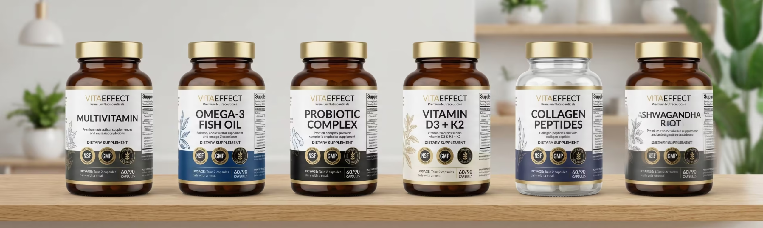
Clinical Credibility Through Visual Language
The visual language of clinical credibility in nutraceutical packaging is precise: clean white or minimal colour backgrounds that communicate purity and cleanliness. Sans serif typography that communicates precision and modernity. Generous white space that communicates confidence rather than overcrowding every millimetre with claims.
The temptation in nutraceutical packaging is to fill every available surface with benefit claims, ingredient callouts, and certification badges. The brands that build the highest consumer trust do the opposite they select the three or four most important things to communicate and give them the space to land with authority.
Ingredient Transparency as Brand Equity
The nutraceutical consumer in 2025 does not simply want to know that a product contains a certain ingredient. She wants to know the source of the ingredient, the form it is in, and the dosage per serving. Brands that provide this information prominently, clearly, and without the obfuscation of proprietary blends are building a form of brand equity that is very difficult for competitors to replicate.
Ingredient transparency on pack is no longer a differentiator in the premium nutraceutical segment it is a baseline expectation. Brands that do not provide it are immediately placed in the suspect category by the informed consumer. Brands that go beyond baseline showing certification of the specific ingredient form, QR codes linking to Certificate of Analysis documents, clinical study references are building the deepest possible consumer trust.
Certification and Compliance as Visual Communication
In nutraceuticals, certifications are not just compliance requirements they are brand assets that must be designed into the packaging with the same care as any other visual element.
- FSSAI certification for the Indian market prominently displayed, not buried in small print
- USFDA compliance for brands targeting the US market the logo mark of this certification carries enormous trust weight with the informed American supplement consumer
- NSF certification for sport and athletic supplement brands essential for credibility in the fitness and performance segment
- Organic certification where ingredient sourcing supports it India’s organic agricultural supply chain is genuinely world class
- Halal and Kosher certifications for brands targeting UAE, Saudi Arabia, and international Jewish markets
Dosage Communication That Reduces Purchase Anxiety
One of the most specific design challenges in nutraceutical packaging is dosage communication. The consumer needs to understand exactly what they are buying how many capsules per serving, how many servings per pack, what the total course duration is, and whether the dosage is aligned with clinical recommendations.
Brands that communicate dosage clearly and simply reduce the purchase anxiety that the sceptical nutraceutical consumer experiences at the shelf. Brands that bury dosage information in small print on the back label or use language that requires a nutritional science degree to interpret increase purchase anxiety. In a category where trust is the purchase driver, increased anxiety directly reduces conversion.
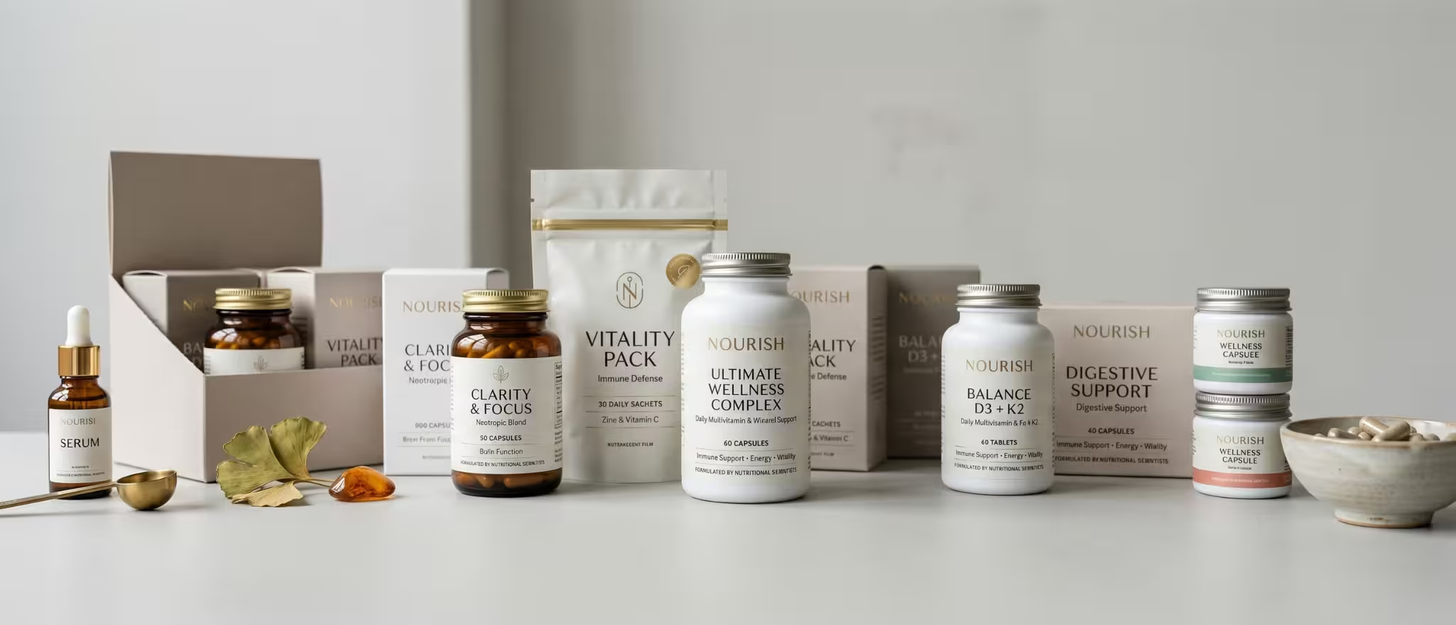
The Premium Nutraceutical Packaging Formats That Win
The format selection in nutraceutical packaging communicates positioning before any label is read. HDPE plastic bottles remain the dominant format for mass market supplements functional, durable, and cost effective, but limited in their ability to signal premium. The premium nutraceutical segment has moved toward formats that communicate more deliberate brand investment.
Dark amber glass bottles with aluminium closures communicate pharmaceutical grade seriousness and ingredient protection. Matte finish HDPE with soft touch coating communicates premium within the plastic format. Kraft paper pouch packaging with a clear window communicates natural and sustainable positioning. Recyclable tin packaging communicates artisan craft and premium gift occasion positioning.
The Indian Nutraceutical Brand Going Global
India has a specific and compelling competitive advantage in the global nutraceutical market: the depth and authenticity of its botanical ingredient heritage. Ashwagandha, brahmi, shatavari, triphala, moringa, turmeric these are not ingredients that India discovered in the last decade of wellness trend activity. They are ingredients that India has used, studied, and refined for thousands of years.
The Indian nutraceutical brand that packages this heritage with clinical precision showing the research, the certifications, the ingredient sourcing story, and the dosage science occupies a positioning that no American, European, or Chinese nutraceutical brand can authentically claim.
The packaging is the first chapter of that story. It must be written with the same rigour and intention as the formulation itself.
Ready to build a brand that commands your market?
Visit richestbranding.com | info@richestbranding.com