Water Ville
- Branding
- Packaging
Water Ville was envisioned as more than a water park. It was designed as a joyful escape where families, friends and children come together to celebrate summer, laughter and shared memories. The brand needed to capture excitement, safety and imagination while standing out in a highly competitive entertainment space. Our goal was to create a visual identity that instantly communicates fun, trust and high-energy experiences for all age groups.
The challenge was to avoid generic amusement park visuals and instead build a distinctive brand world. Water parks often rely on cluttered graphics, loud colors and inconsistent messaging, which can dilute brand recall. Water Ville needed a cohesive identity that balanced playful energy with clarity, ensuring appeal across kids, parents and young adults, while remaining adaptable across large-format hoardings, digital campaigns and on-ground signage.
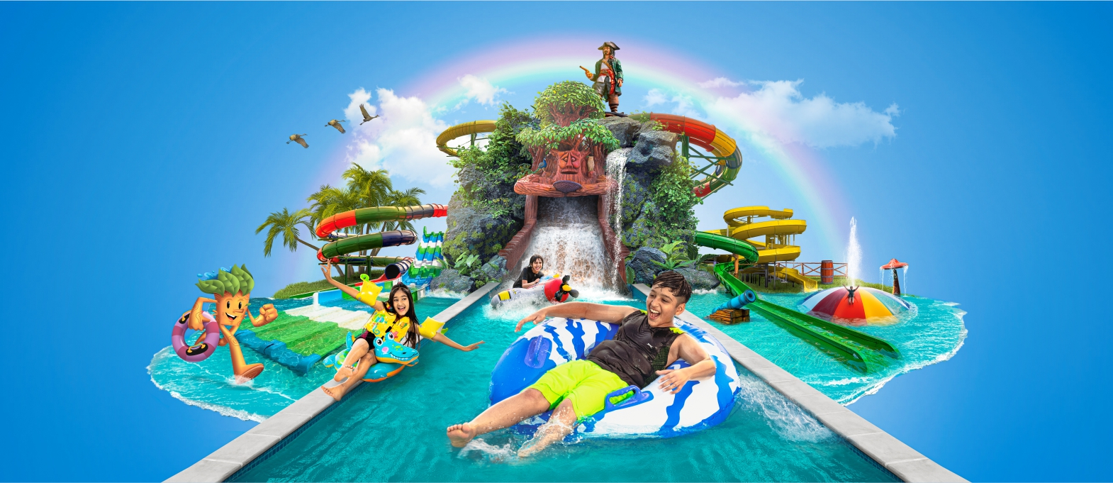
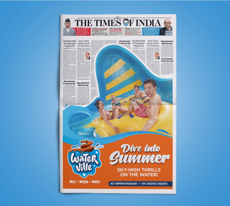
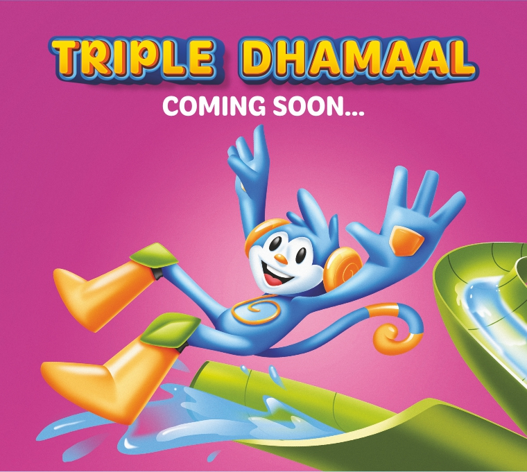
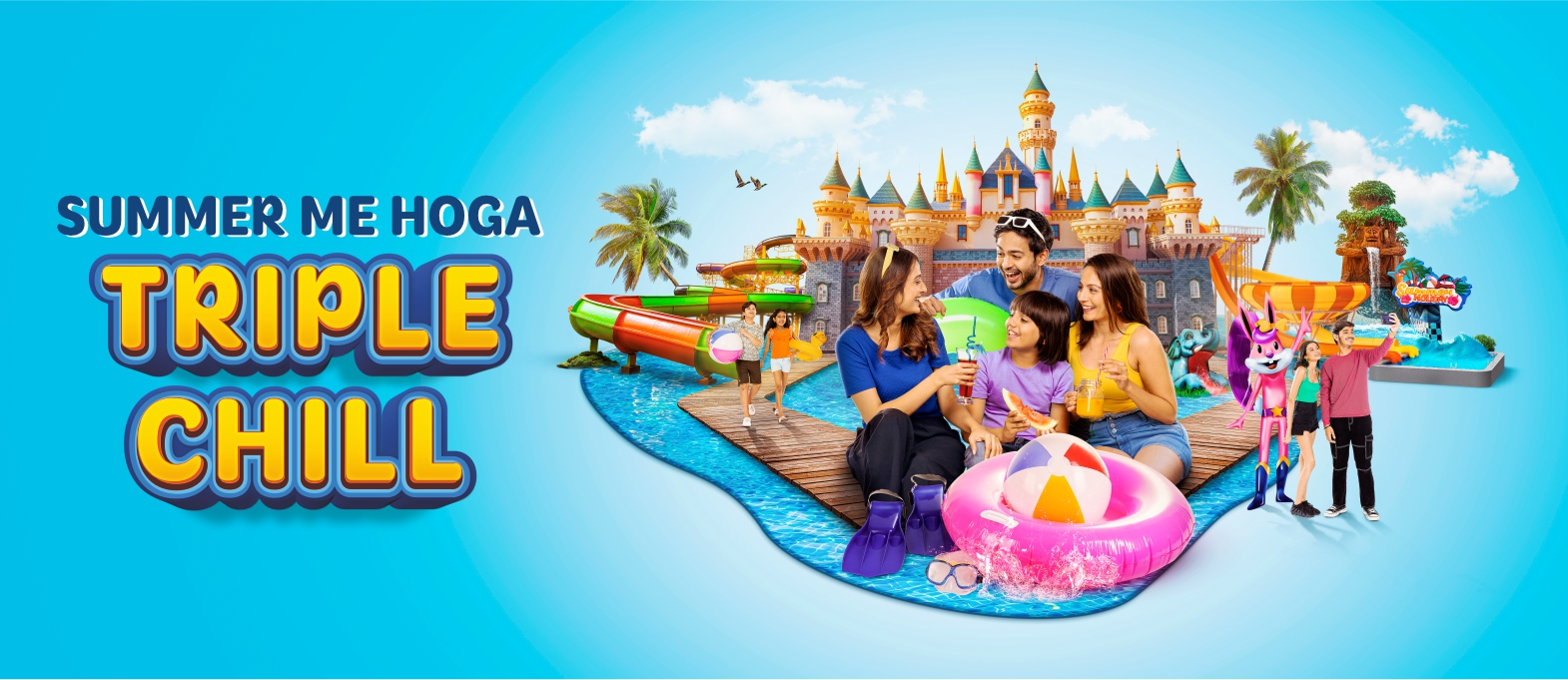
We crafted a bold, character-driven identity rooted in motion, color and storytelling. The logo and visual system draw inspiration from flowing water, slides and splash moments, using rounded forms and vibrant hues to evoke excitement and approachability. Campaign visuals were designed as immersive worlds rather than static ads, bringing the park experience to life even before visitors arrive. The result is a lively, memorable brand that feels inviting, energetic and built for unforgettable summer moments.
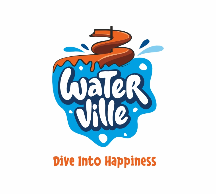
Dive Into Happiness
Water Ville’s brand language is built around emotion and experience. From playful typography and dynamic compositions to vibrant campaign visuals, every element works together to spark anticipation and joy. The identity system scales seamlessly across billboards, digital creatives and on-site branding, creating a unified experience that feels exciting, safe and family-friendly. Water Ville now stands as a destination brand that doesn’t just promise fun, it visually delivers it at first glance.