Study the Shelf Before You Design the Pack: How Competitive Shelf Analysis Builds FMCG Brands That Win
April 23, 2026Study the Shelf Before You Design the Pack: How Competitive Shelf Analysis Builds FMCG Brands That Win
The most common and most expensive mistake in FMCG packaging design is designing in isolation sitting in a studio, looking at moodboards and competitor references on a screen, and producing a design that looks good as an isolated object. Then watching that same design disappear into the competitive noise of the actual retail shelf it was built to stand out from.
Great FMCG packaging is not designed in isolation. It is designed in context. And the most important context is the shelf the precise retail environment where the product will compete for attention against every other product in the category, simultaneously, under real lighting conditions, for a real consumer with three seconds of attention and twenty other things on their shopping list.
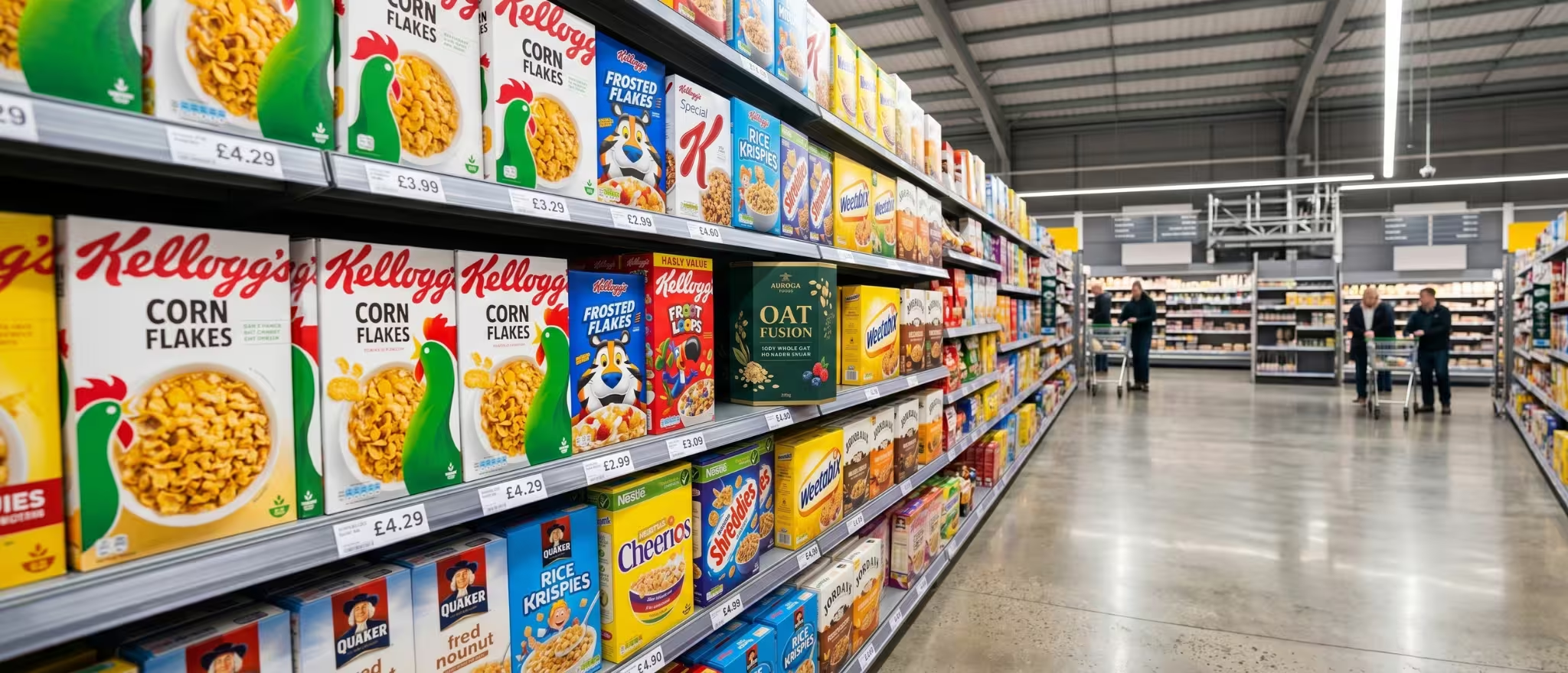
At Richest Branding, shelf competitor analysis is a foundational step in every packaging design engagement. Before a single design element is created, our team studies the shelf. Not the internet. The actual shelf in modern trade, in general trade, in the export retail environments the brand is targeting. What we find in that study shapes every design decision that follows.
What a Shelf Competitor Analysis Actually Reveals
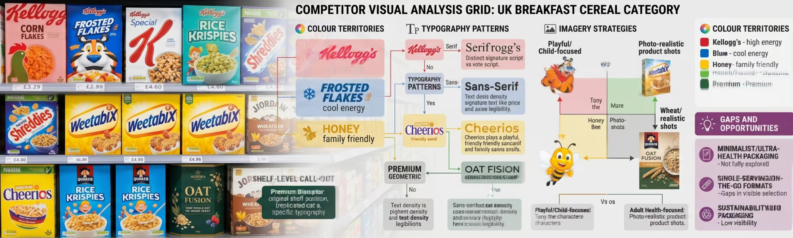
The Colour Map of the Category
Every FMCG category has a colour map a pattern of which colours are being used by which competitors, which colours have become so associated with specific brands that using them would create confusion, and which colour territories are genuinely unowned.
In the spice category, for example, the dominant colours across Indian brands tend toward reds, golds, and ochres communicating warmth, heat, and traditional quality. A new spice brand that enters the category with a deep teal or slate grey packaging may be taking a significant risk breaking category code too dramatically or may be making a brilliant strategic move to own a premium, differentiated position that none of the existing brands occupy.
The shelf competitor colour map tells you which choice is which. Without it, you are guessing.
The Typography Voice of the Category
What typefaces are the existing brands in the category using? Are they heavy and traditional, suggesting heritage and trust? Light and modern, suggesting premium and sophistication? Script and handwritten, suggesting artisan craft and authenticity? The typography voice of the category is a set of consumer expectations implicit rules about what this category looks like that a new or rebranding brand must consciously decide to follow, partially follow, or deliberately break.
At Richest Branding, this analysis informs one of our core strategic recommendations: whether a brand should seek to earn credibility by partially respecting category conventions while introducing differentiation, or whether the category conventions themselves are so uniform that a deliberate break from them is the most powerful positioning available.
The Imagery Language of the Category
What imagery is being used by existing competitors? Product photography, ingredient photography, lifestyle imagery, illustration, abstract graphic design the imagery language of a category communicates what kind of brand the consumer expects to encounter here. A category dominated by ingredient close up photography can be powerfully disrupted by a brand that uses lifestyle photography. A category of lifestyle brands can be disrupted by a brand that leads with ingredient provenance.
The Four Competitive Positioning Options on the Shelf
Option 1: Category Leader Positioning
Some brands choose to communicate through their packaging that they are the category leader dominant, established, trusted. This positioning uses the most credible visual language in the category: the strongest colours, the most confident typography, the most premium materials. It works best for brands that genuinely have the market position to support this claim either through history, through distribution scale, or through product quality that is provably superior.
Option 2: Premium Challenger Positioning
The most common high value positioning for new FMCG and skincare brands is the premium challenger a brand that enters an established category and signals, through every packaging decision, that it is the premium alternative to the existing options. This positioning typically requires breaking the category’s visual conventions rather than following them, using better materials and finishes than the established brands, and communicating a brand story that the mass market brands cannot claim.
Option 3: Niche Specialist Positioning
Some brands win by owning a specific, deeply understood segment of the category rather than competing across the full shelf. A spice brand that owns the single origin premium segment. A snack brand that owns the high protein fitness segment. A skincare brand that owns the Ayurvedic clinical active segment. Niche specialist positioning on shelf is communicated through precision and focus a packaging design that speaks with great clarity to a specific consumer rather than vague appeal to everyone.
Option 4: Disruptor Positioning
Occasionally, a brand has the product, the story, and the brand team to enter a category and break the visual conventions entirely. The disruptor uses packaging design to signal: this is not another version of what you already know. This is something new. This positioning carries the highest risk and the highest reward and requires the deepest understanding of the shelf it is disrupting.
How Richest Branding Applies Shelf Analysis to Design
Our team at Richest Branding brings practical retail experience across Indian modern trade, general trade, and international export markets. We have studied shelves in Ahmedabad, Mumbai, Bengaluru, Dubai, and Singapore. We understand the specific visual environments our clients’ products will compete in not as a theoretical framework, but as a practical design input that shapes every packaging decision.
When we present a packaging design to a client, we present it in context: shown on a simulated shelf alongside the actual competitor packaging we studied. We are not showing you a beautiful object. We are showing you a competitive weapon designed to win a specific battle on a specific shelf, against specific opponents, for a specific consumer.
That is the difference between packaging design and packaging strategy. And it is the difference Richest Branding brings to every engagement.
Ready to build a brand that commands your market?
Visit richestbranding.com | info@richestbranding.com